DAAA’s luxury apartment on Places Magazine Cover
The Italian Job
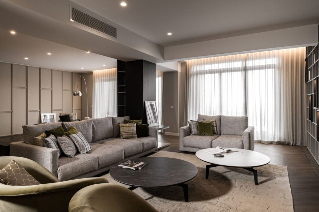
The 621-square-metre duplex apartment at Portomaso Marina, codenamed The Italian Job, reflects the essence of “Made in Italy”. For Keith Pillow founder and creative director of DAAA Haus Group, entrusted with the project, it is a timeless, elegant, contemporary home away from home; the epitome of Italian taste and a true reflection of its owners.
When you look at a home, you can almost imagine exactly who lives in it. How influenced were you by the lifestyle and character of the owners?
Every time we have a new project, we first meet the client and carry out a detailed questionnaire to compile a proper brief, to better understand their life, lifestyle, tastes; to understand their routine amd the requirements for their new home. In fact, this project, codenamed The Italian Job, reflects everything that is “Made in Italy”.
The owners of the property, being Italian and from towns neighbouring Treviso [an area synonymous with furniture production], asked us during the brief to work with certain brands as not only did they have direct contact with these, but they also reminded them of home. The end result is a timeless, elegant, contemporary home away from home. As with the top-notch northern Italy furniture showrooms, the details make the difference, creating an overall wow factor throughout the property. In fact, from the main hallway, with its architectural, floating staircase, to the maid’s quarters, no detail was overlooked.
What did you set out to create and what were the most important elements that helped to achieve your aims?
This project doesn’t only reflect functionality and good design, but also the influence of the culture of its Italian inhabitants.
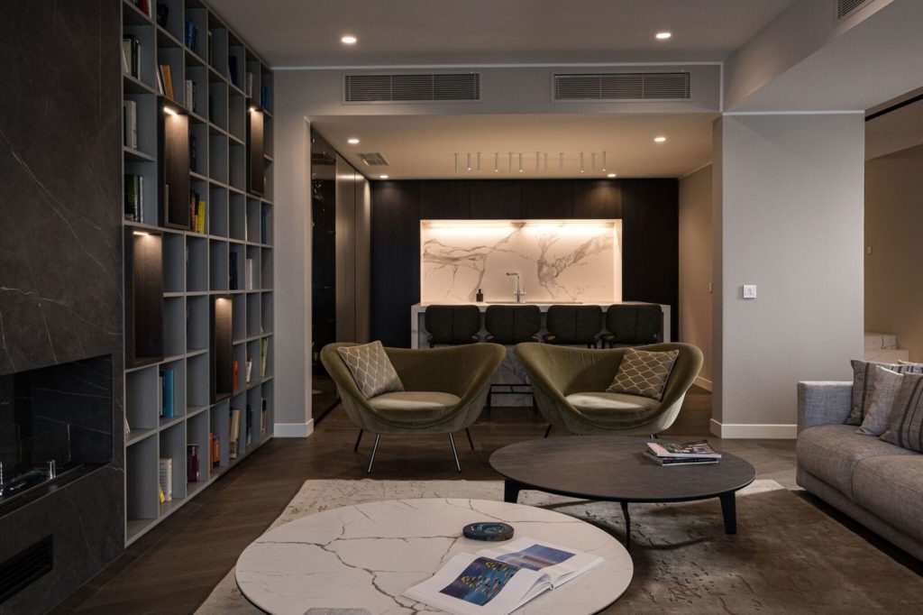
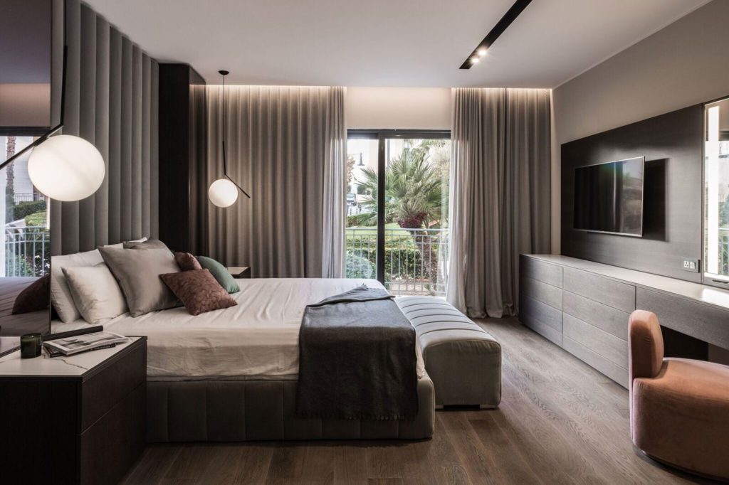
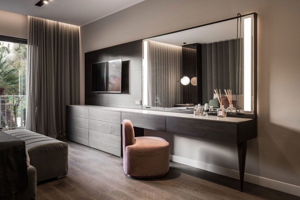
A contemporary, high-end aesthetic prevails throughout, creating a warm, luxurious atmosphere that reflects the true character of the clients and the way they live the space. It was achieved through good planning of the space, the use of stylish Italian design brands and good lighting.
You seem to have gone for a neutral palette and a uniform colour scheme throughout… Does that always work and how do you avoid monotony?
This palette was chosen in accordance with the clients’ taste and preferences and their wish to create a sophisticated, timeless and elegant environment. Although this colour scheme appeals to us too, our approach/choices change from client to client, so we can work with any palette to achieve something aesthetically unique and functional. The focus remains bringing our clients’ preferences and personality to life in a functional and aesthetically rich space, irrespective of the chosen palette. As for whether a neutral scheme always works, monotony can be avoided with the use of block colours in changeable/dynamic objects such as art, rugs and accessories.
What is the pièce de résistance of this space?
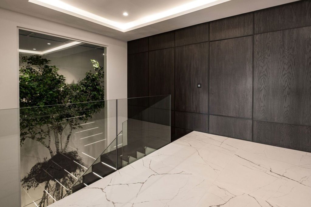
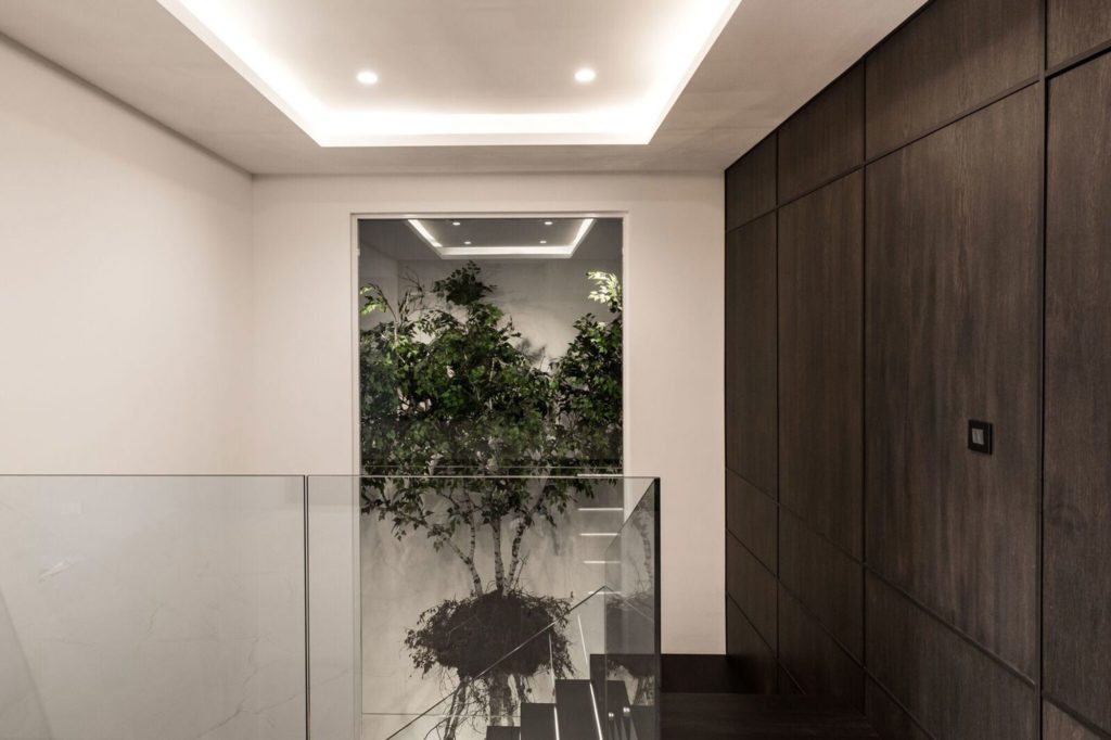
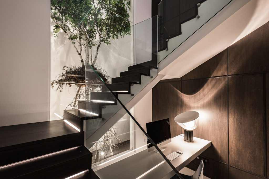
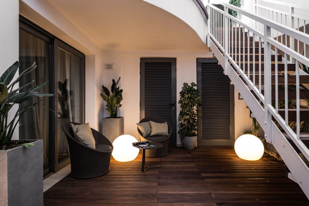
The part that characterises it and leaves the most impact is the internal shaft/yard as soon as you enter, with hanging tree and floating, modern staircase. It is a stunning feature, central to this duplex apartment.
And what gave you the biggest headache?
I would say the tight deadline and the clients’ need to see to all the little details. At the end, everything turned out well and it was an amazing experience working closely with them and talented artisans with each custom-made furniture piece coming from abroad and having to fit perfectly into its allocated space.
So, was all the furniture custom-made, or do you prefer to pick up one-off peices from here and there?
The project was a combination of both. We have the bespoke furniture combined with ready-made piees. We worked with some of the best italian artisans and brands such as Casamania, Rubelli, Flos, Fedrali, Varaschin and Drigani etc etc…
What materials, textures and fabrics did you go for to achieve the desired look and feel?
Some of the fabrics were chosen from Rubelli, a very high-end company that offers the best quality and a variety of textiles. We used soft and neutral tones, a monotone palette, with a touch of accent colours to add character to each room with that one main shade. As for textures, we used a combination of textiles, including some traditional Italian post-modern leathers. The repetition of the same material/tones helps maintain the harmony and coherence of the space when you walk from one area to another…
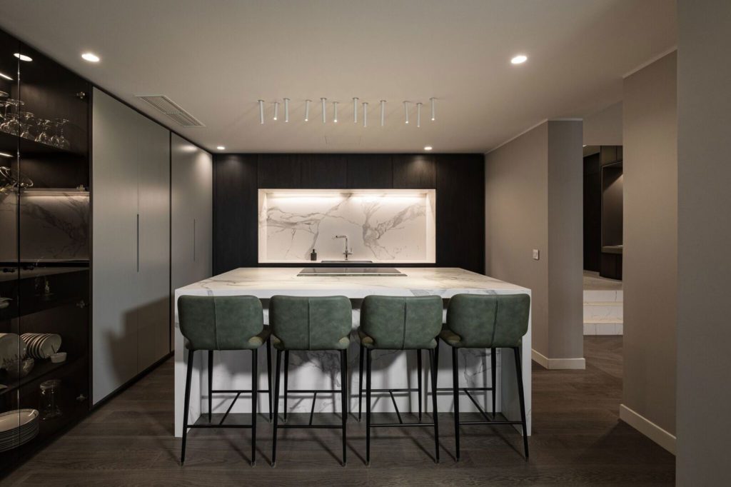
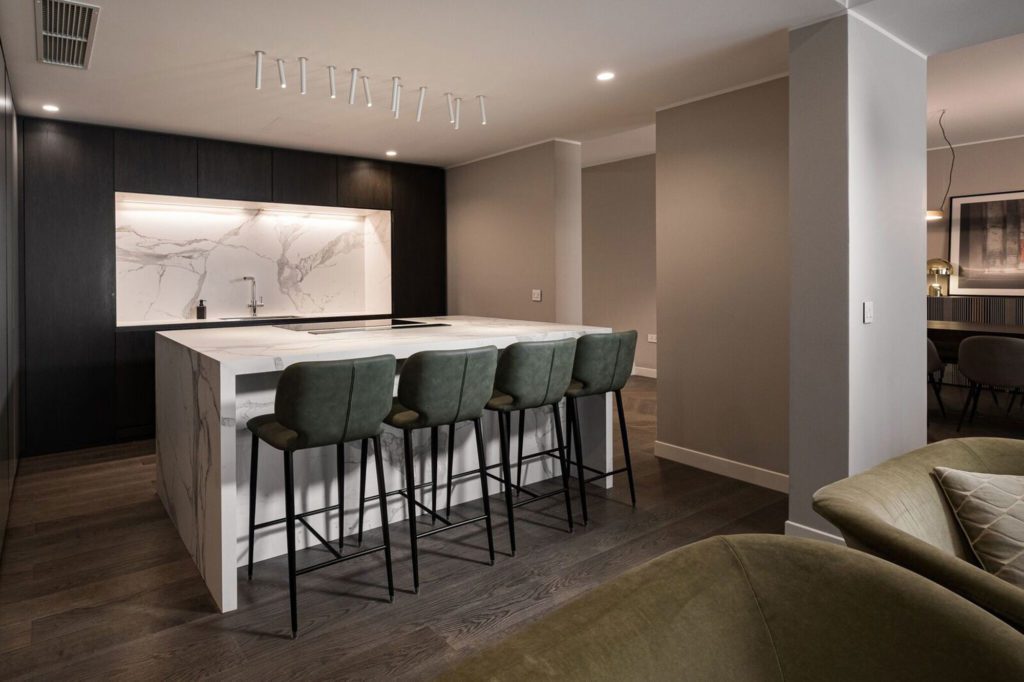
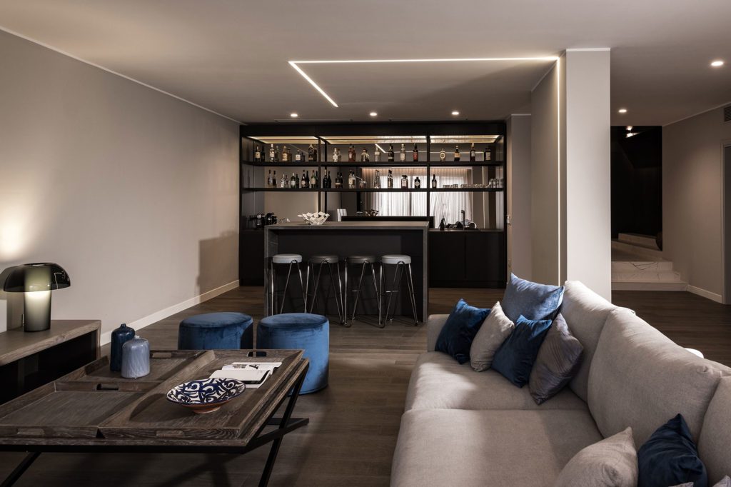
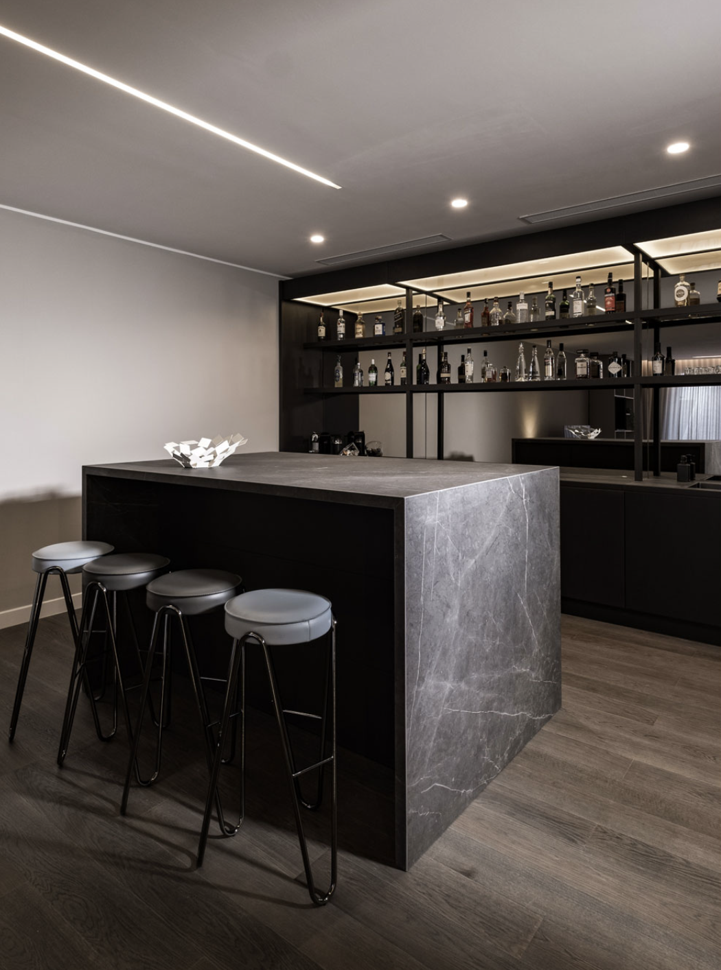
The ‘bar’ – subtle as it may be with the ‘block’ and stools – is quite an ‘extra’ luxury in a home. How important is it to think of and include entertainment and catering when designing a place to live in?
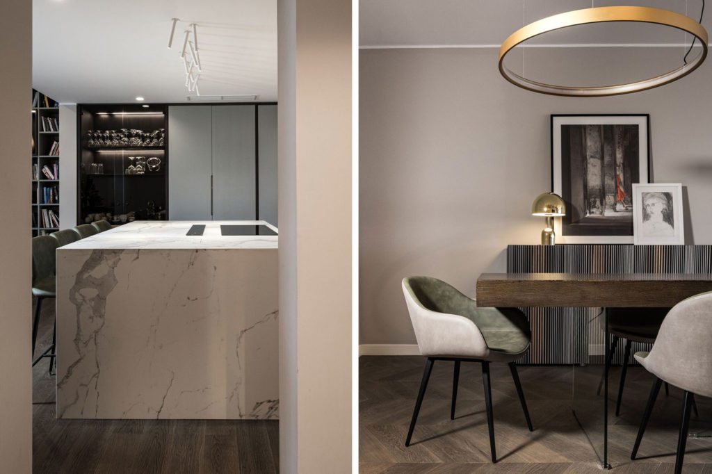
It’s very important to include some form of an entertainment area in a home of this size. This was also part of the client brief as they love to entertain friends and relatives every week. Italians living abroad tend to miss the culture of the aperitivo here, so it is something they organise regularly at home. The area also lends itself as a comfortable, daily TV room.
Was the ceiling-to-floor library inspired by the owner’s book colelction, or was it a design element you absolutely wanted to incorporate?
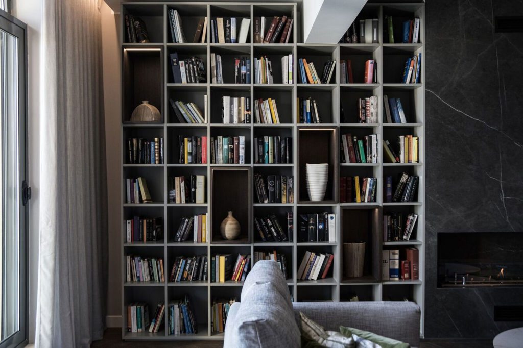
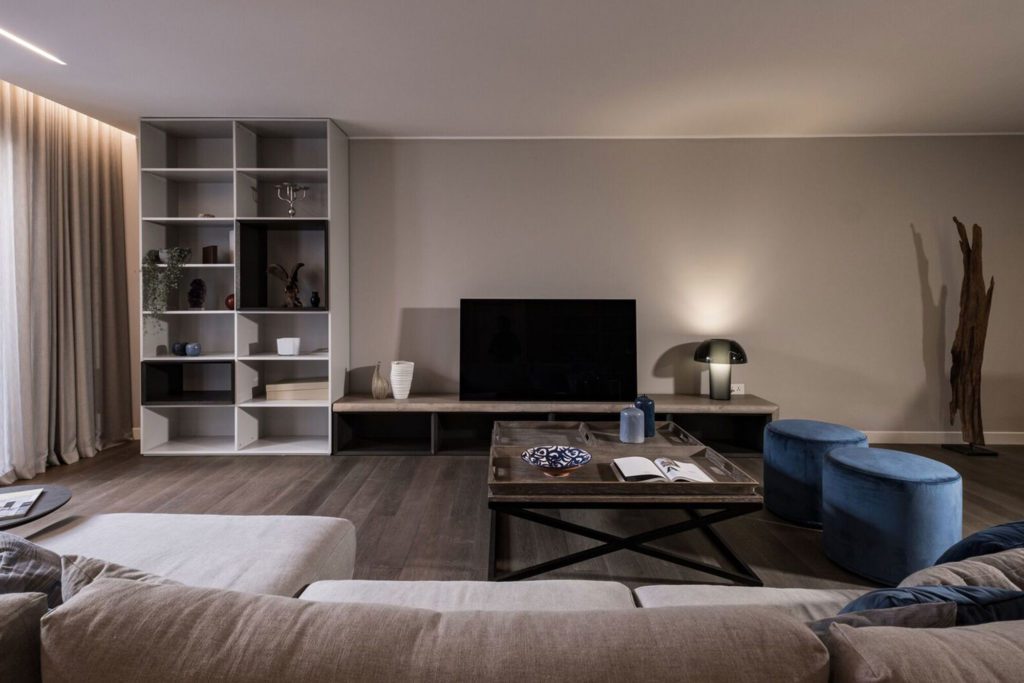
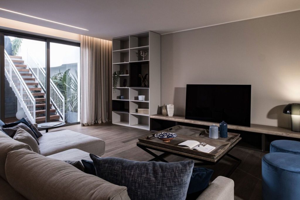
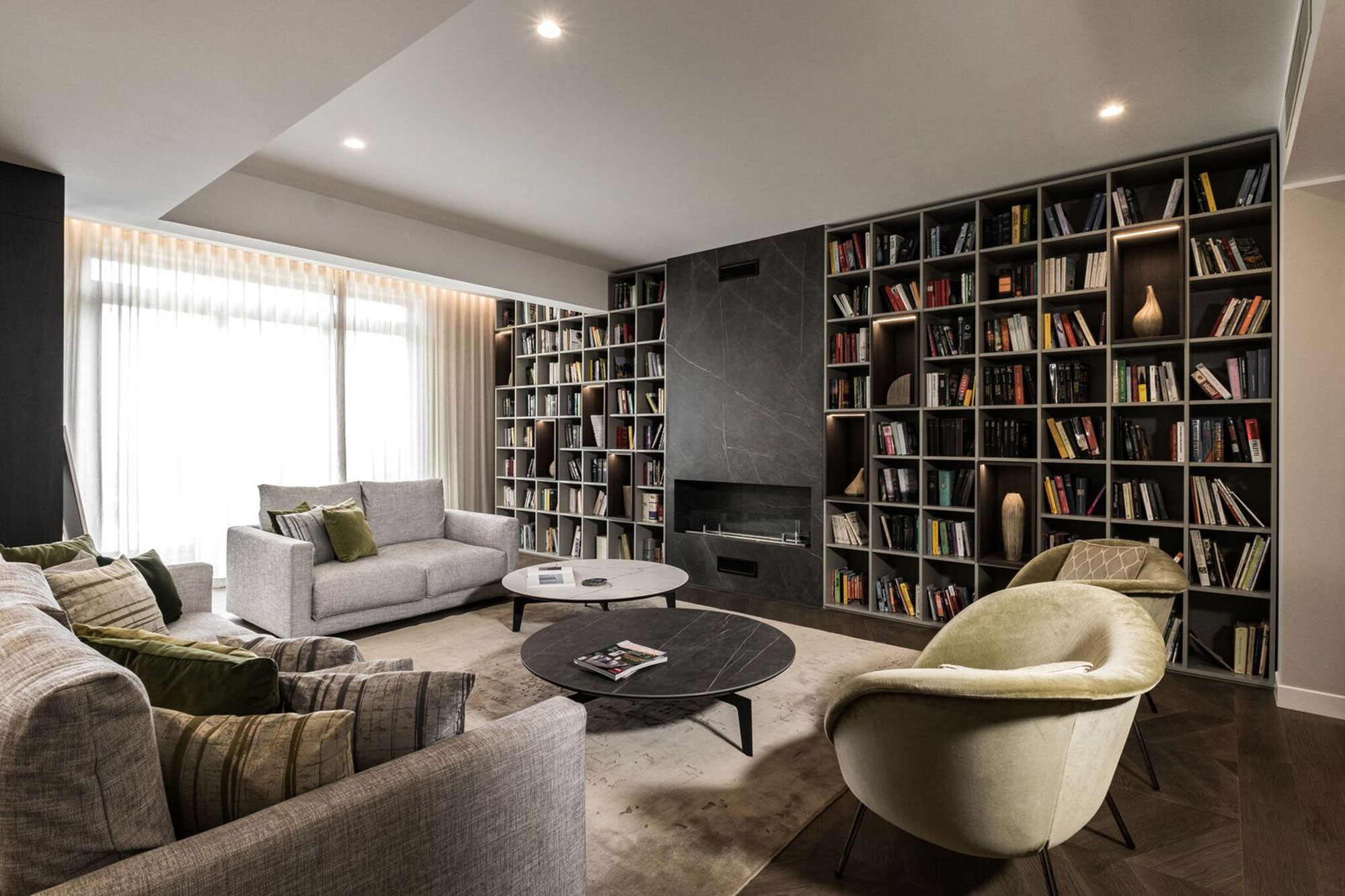
I would say a bit of both. The client had specifically pointed out that she had a huge collection of books, so we thought to place the library in the main living room area, built around an ethanol fireplave and without TV. This space was inspired by the old, great Italian palazzos’ sala nobile or sals di conversazione.
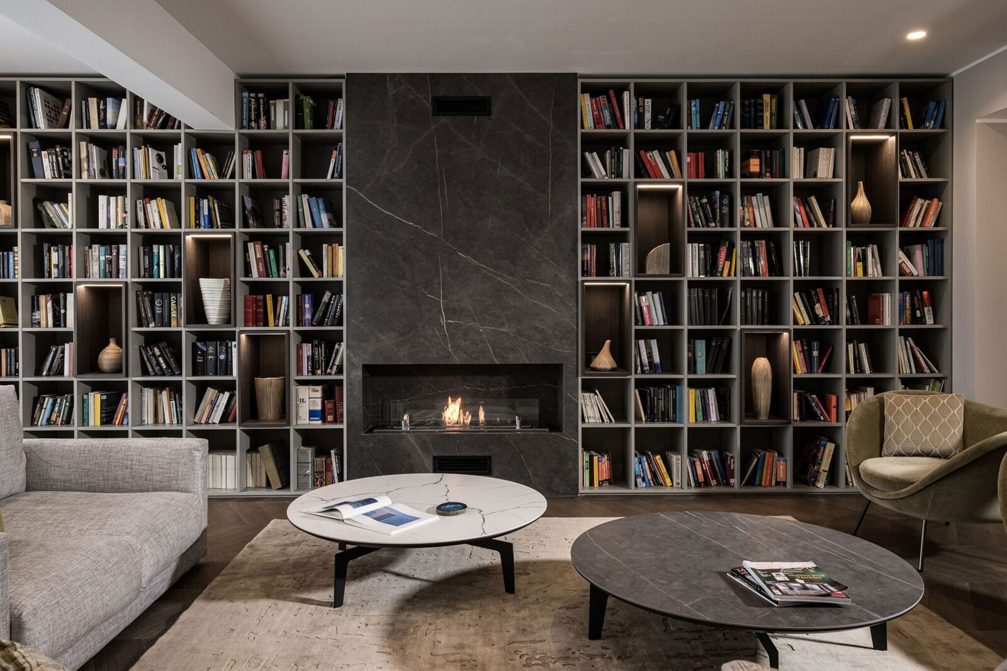
Lighting seems to play an important part, especially in the stairway area… What mood did you set out to achieve?
Lighting is always very important. Apart from the decorative aspect, which is vital, the space did not have much natural light in the basement and in the middle part of the property, so well-thought-out architectural lighting was installed. An example is the artificial daylight we managed to recreate around the hanging tree installation situated in the central shaft. By combining green with natural, hidden, architectural light, we managed to mimic very well the idea of sunlight shining through a central courtyard.
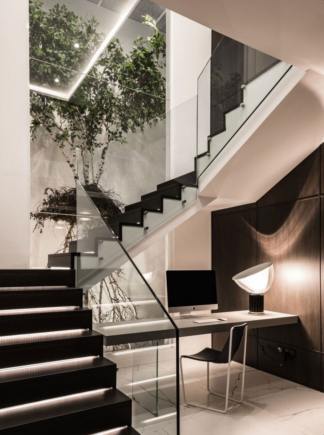
No corner has been overlooked, with the study being incorporated smartly under the stairs. What are the tricks to amximise the use of space, while making everything seem seamless?
Design is in the details and in maximising the use of available space. In order to have a work-from-home desk, a study was incorporated under the stairs using light materials, with hidden filing storage behind the wood clad wall. Sometimes, the function is inspired by the site, and the others, even the aesthetics can lead to something functional. In this case, it just made sense to put the study under the staircase since we had already solved the problem of the dark, dingy shaft. This, in turn, enabled us to light up the dead space under the stairs, amking it perfect for passively used study area. The made-to-measure furniture and floor-to-ceiling boiserie maximise the space and make it look bigger, as do the tones and materials used and repeated in the whole property, but in different forms.
What is the most luxurious item, and the simples; and how do they sit together in harmony?
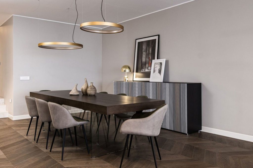
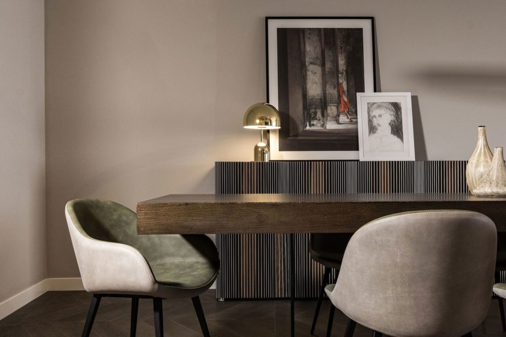
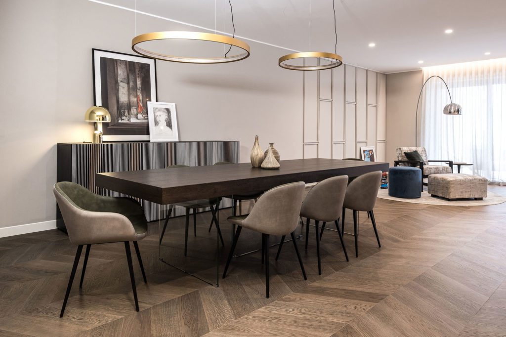
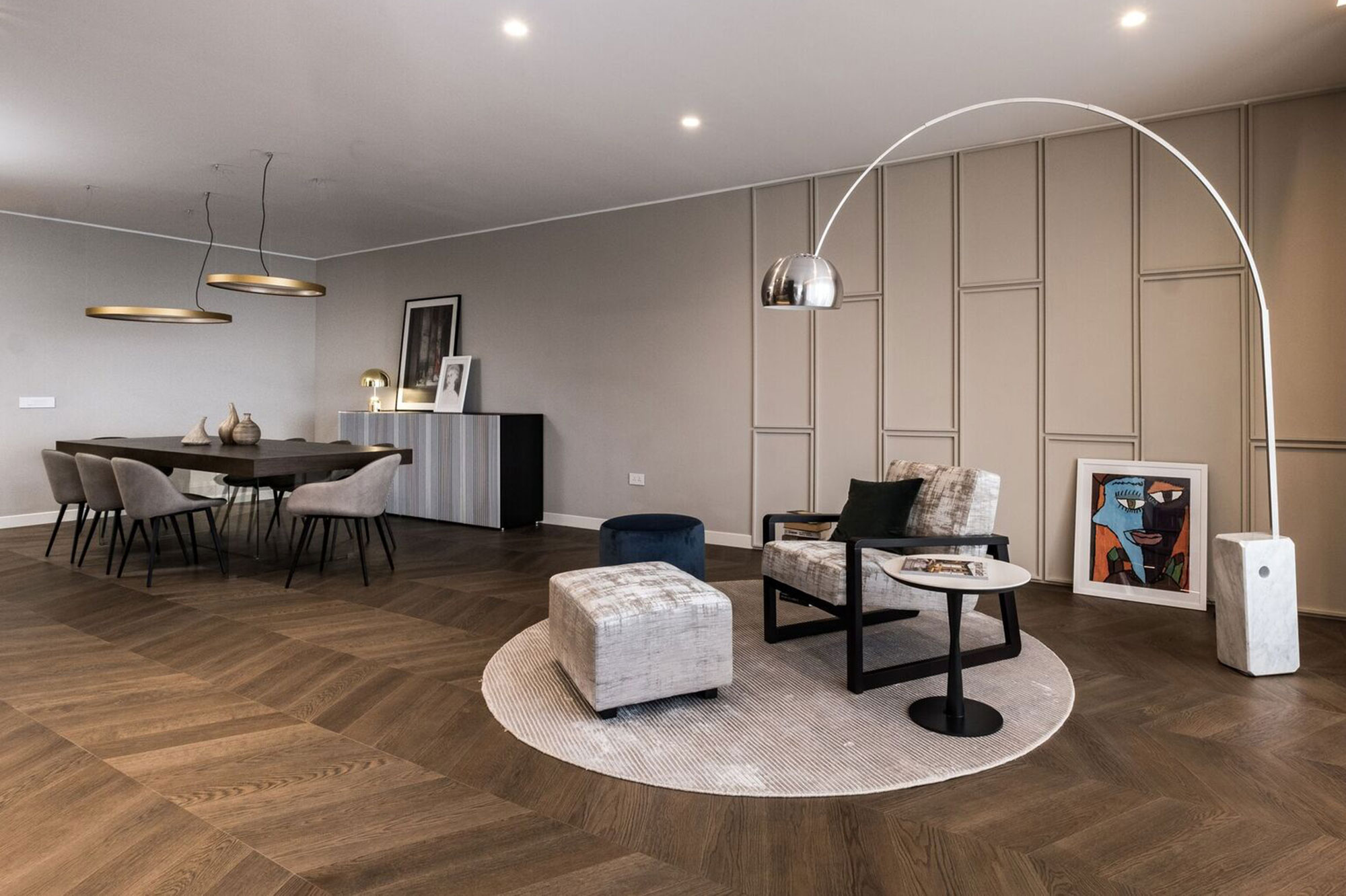
This question could be answered from many different perspectives, one of which could be the detail of the paritition in the library itself. If you look caefully at the library, with the huge personal colelction of books sitting right next to the curated sculptural art pieces, this balance is achieved by paying attention to the colour tonality and forms of objects chosen to adorn the shelf. The bigger shelf, with a subtle difference in the colour, also simultaneously acts as the frame for the objects. Another details we chose from the onset of the project, which sits perfectly in this environment, is the Casamania sideboard behind the dining table. It adds a hint of colour… but not too much.
How does one strike a balance between cosiness and minimalist design – as seems to be the case in this apartment?
Generally, a minimalist design is perceived as something empty. While it does suggest having less objects around, at the same time, such a space can still be cosy. It attention is given to the right texture in fabrics, colours and other materials, following the tones/palette of the space, you can create a sense of warmth in a minimalist space. Repetition and continuity also help achieve this. To give an example of this project, the separate area in an open-plan living/dining is defined by the round rug. The textures are balanced by the upholstery of the chair, the ottoman and complementary cushion on top. While there are many textures within this small area, other materials, such as the amrble of the floor lamp or the wooden floor itself, are in coherence.
The most used and ‘happy’ place?
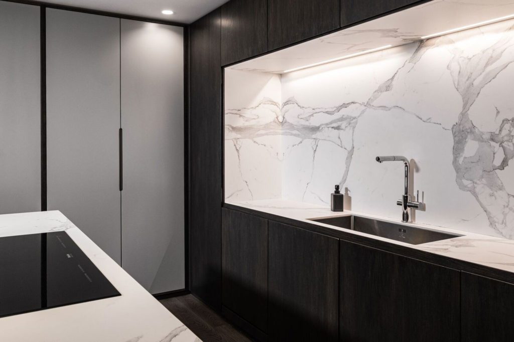
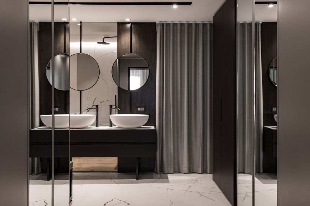
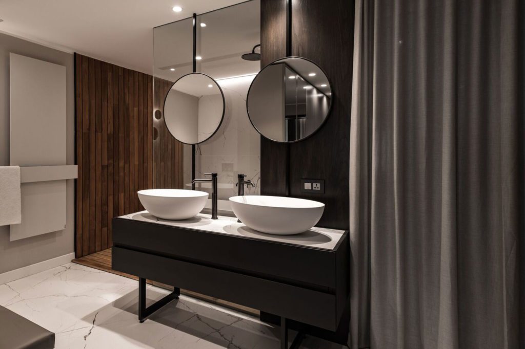
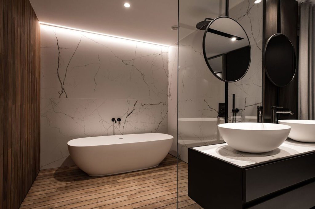
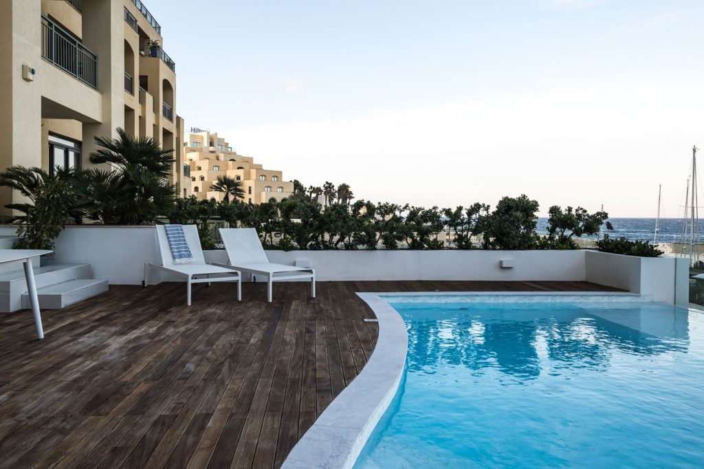
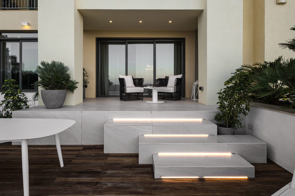
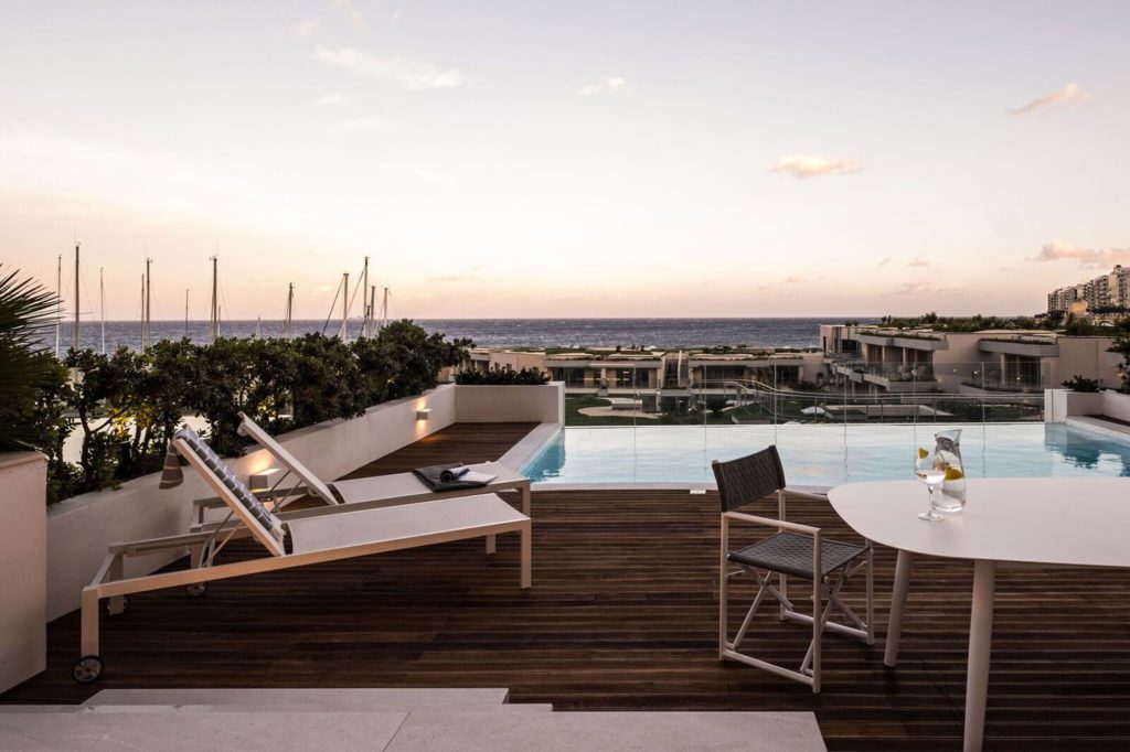
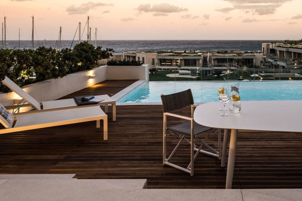
All areas are used, and all transmit a happy moment: from the spacious, super-luxury en-suite bathroom to the sper-sized walki-in wardrobe; the fine and well-thought-out kitchen; and the pool area, with its amazing infinity pool over Portomaso Laguna, across the Sliema promenade, with open-sea views.
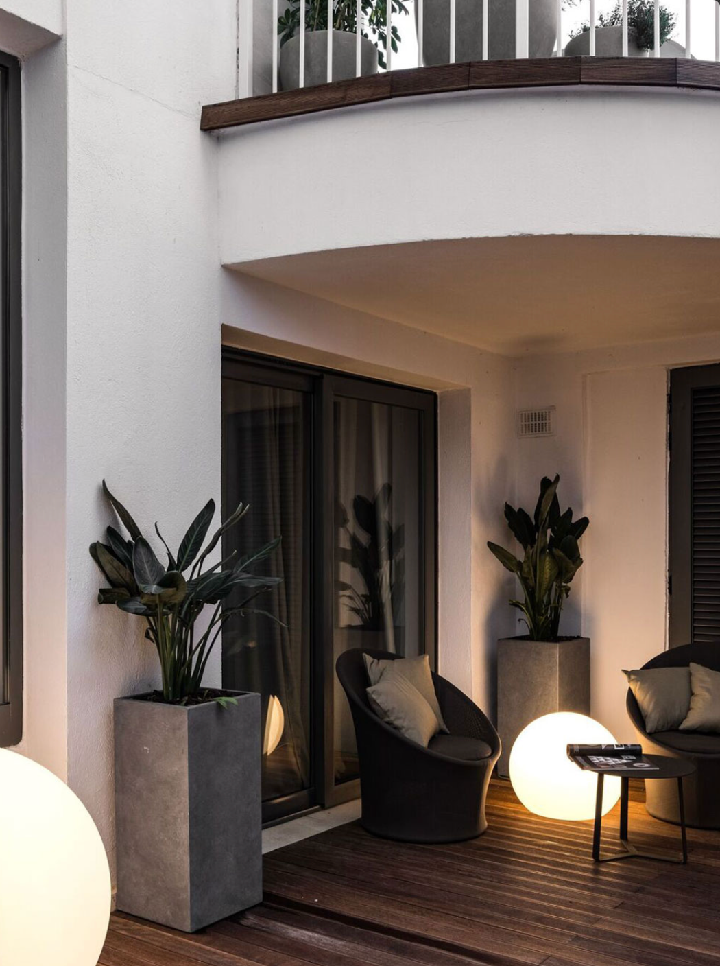
In fact, this apartment also has an outside space, with terrace and pool. How did you treat this unqiue feature?
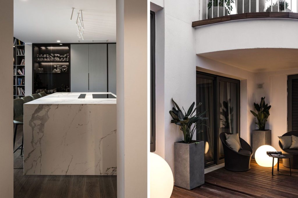
We wanted to leave the pool and the view of the sea take centre stage, so we left everything simple, using a mid-shade of decking flooring that emphasises the colour of the blue water.
With so many apartments on the market, what, in a nutshell, makes this one stand out?
Anyone visiting the apartment is wowed by the minute detail. It could be ebst described as timeless, Italin style, warm and tasteful.
Click here to read the article in PDF
